

Download All Country Data

By late 2020, several months into the COVID-19 pandemic, broad lockdowns and closures in the United States had given way to more targeted public health and social measures in cities and states across the country. The risk of getting infected varied across the country and from week to week. Different states—even different cities within the same state—had different mandates on masking, social distancing and indoor dining. People had to navigate an ever-growing hodgepodge of regulations and recommendations to make personal decisions about their risk for infection, even as winter 2020 saw a substantial COVID-19 surge.
Using alert levels to inform the public
Beginning in January 2021, RTSL partnered with the New York Times and Johns Hopkins University to develop an online, interactive Guide for Covid-19 Risk in U.S. Counties.
Published on the Times’ website, the guide featured a U.S. map in which each county was assigned one of five color-coded risk levels: low (green), moderate (yellow), high (orange), very high (red) or extremely high (purple). Each county’s COVID-19 risk was determined by an algorithm that weighed the number of cases per person reported during the previous two weeks and the percentage of tests returning positive. County risk levels were updated as new data became available.
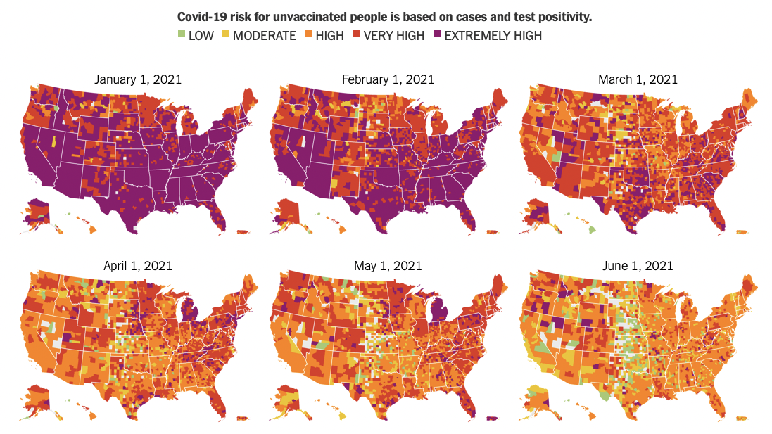
A map of the U.S. from January 2021 – June 2021, with each county color-coded according to its risk-level for Covid-19 at the time.
By selecting a county, users could observe trends in COVID-19 risk over time and view recommendations on specific activities, including participating in indoor activities, hosting events, attending in-person school and seeking non-Covid-related medical care, tailored to the county’s current risk level.
As vaccines became widely available through 2021, the guidance offered further differentiated risk assessments based on vaccination status. For example, an unvaccinated person in a moderate-risk county would be encouraged to avoid all but nonessential travel. A vaccinated person in the same county could travel more freely.
The guide—which covered more than 3,000 U.S. counties—was a large undertaking that drew on the expertise of each partner. A team at the New York Times designed the guide and pulled case data at the state and county levels. Epidemiologists and other public health experts from Resolve to Save Lives provided a framework for determining risk levels, and helped to translate data into clear, actionable guidance for the public by defining the appropriate precautions for each risk level. Johns Hopkins University reviewed the content and provided technical recommendations. By hosting the guide on its website—and featuring it on the front page of the paper—as part of its extensive COVID-19 coverage, the New York Times made the resource accessible to millions of readers.
“When the guide was released, it was really the only place where you could find readily accessible information about COVID risk at the county level, paired with guidance for what to do,” said Shama Cash-Goldwasser, Senior Technical Advisor for Resolve to Save Lives. “There was a lot of conflicting guidance out there about COVID-19 risk and safety. This guide served as a way that people could get the most locally appropriate and applicable data available and be empowered to make as informed of a decision as possible.”
The guide was officially sunset on March 1, 2022, in part because the U.S. Centers for Disease Control and Prevention began including county risk levels in its COVID-19 data tracker in February 2022.
Although the guide is no longer being updated, it is still available on the New York Times website, and provides visuals about how COVID-19 risk levels had changed throughout the 14 months in which the tracker was active. We can see what risk levels looked like during surges caused by the Delta and Omicron variants as well as during times with fewer cases.
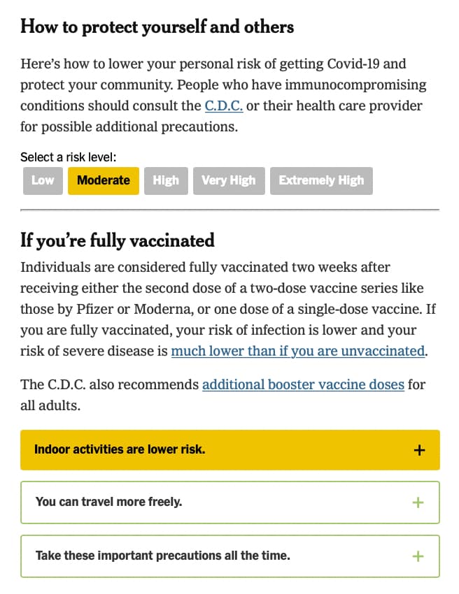
Guidance differed across five risk levels and vaccination status
Lessons learned from a successful alert-level system
The guide modeled some of the most important components of alert level systems: it measured COVID-19 risk in a standardized way, with transparency about the criteria used to determine risk and clear cut offs between levels, and it was regularly updated to allow for changes in conditions over time. Most importantly, the guide helped people understand COVID-19 data– case rates and test positivity– in the context of their day-to-day lives by pairing each risk level with recommended risk reduction behaviors.
The wide reach and prestige of the New York Times meant that the guide was accessible to, and trusted by, millions of readers. The media can be a powerful partner in risk communications, when supported by transparent data and simple recommendations. As new health threats continue to emerge, public health and media can partner to provide trustworthy data and actionable recommendations to the public.
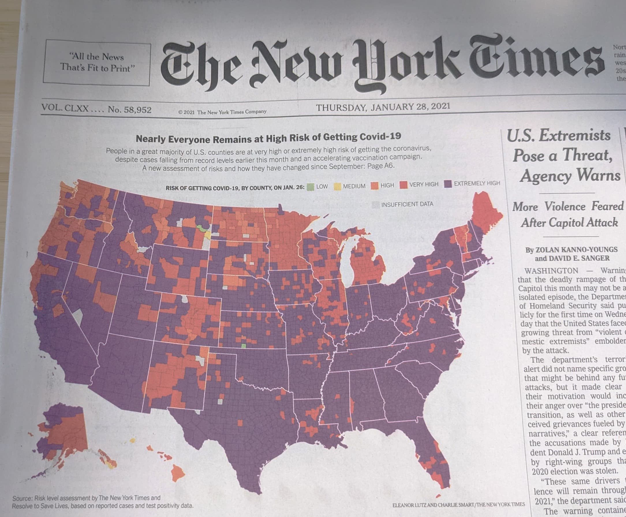
The guide appeared on the front page of the New York Times
Recent Success Stories
View all
Welcome to the Leadership and Learning Laboratory for Health Security Leaders
February 29, 2024
PMEP equips health security experts with practical, technical and leadership skills

Sprinting towards health security: how Zambia built an outbreak surveillance system in just one week
December 18, 2023
Design sprints from the tech world are changing the game in public health

Better epidemic preparedness through strategic legal reform in Nigeria
December 20, 2022
A single guide can support all 36 states in contributing to national health security