As some countries and US states roll back the public health and social measures (PHSMs, also known as physical or social distancing) enacted over the past several weeks, many are predicting a new wave of COVID-19 cases as a consequence. Assessing the potential impact is critical because timely data can help governments adjust their plans if there is a spike in cases. Assessment may also give other governments insights into the safest and most effective ways to reopen their economies.
Key measures to observe going forward include mobility, COVID-19 or flu-like symptoms, new confirmed cases, COVID-19 hospitalizations, COVID-19 deaths, and other excess deaths. In this insight we describe each of these measures as well as their pros and cons for identifying a potential resurgence in COVID-19.
Mobility measures: Many companies have provided mobility data using anonymized cell phone data. These data were initially used to understand the impact of the stay at home orders and other public health and social measures; looking forward, these data can be used to understand the impact of phased reopening. Preliminary data indicate that reopening does not always lead to large changes in behavior. Mobility measures can provide a rough proxy for increases in close contacts (coming within six feet of someone for a prolonged period of time) and other opportunities for disease transmission. Measures such as daily trips per person indicate how often people leave home; others give information about what types of places (retail, grocery stores, etc.) they are visiting. They cannot provide information about physical distancing, wearing masks or taking other precautions while out.
After infection people take, on average, five days to develop symptoms and longer still to get tested and receive results; changes in mobility may be seen at least a week before any other measures. Because the mobility information is location-specific, it may also help provide information to recalibrate PHSM. In theory, mobility data could be available instantly, but many platforms have infrequent updates and data releases can be one or two weeks behind. Many are US-specific, but data from Google is available globally and data from Apple is available in a number of countries as well. Data should be interpreted with caution in countries where smartphone penetration is low.
Syndromic surveillance: After mobility changes, the next detectable change should be in the number of people with respiratory, COVID-19-like or influenza-like symptoms coming to emergency departments and doctor’s offices. This allows for a type of surveillance known as syndromic surveillance. This is a leading indicator as it counts both the number and the proportion of people whose main complaint may be indicative of COVID-19 before they have a positive test or formal diagnosis and are reported to health authorities. Three or more days of outbreak signals from syndromic surveillance systems is a warning sign that COVID-19 cases may be rising, especially when numbers are above what would be expected for the season. For some jurisdictions, such as New York City, this data is available quickly, within a day. If the data are not immediately available, as is the case for the U.S. CDC’s reports of flu-like illness, it is more difficult to use as a core indicator.
In addition to formal syndromic surveillance, many organizations are surveying the public on their symptoms to help understand the spread of COVID-19. Facebook has been using its platform to recruit users and has been making data on the percent of people with possible COVID-19 symptoms available for the US. Given that these measures are new, it is not yet clear how best to use or interpret them.
Confirmed cases: The number of daily confirmed cases is one of the most widely reported indicators and will be one of the key data points to watch as countries begin to open up their economies. A consistent increase over a 5-day period would be a warning sign of a rebound, particularly in a community with already elevated transmission. Challenges with this indicator include:
- Widespread testing is needed ensure that cases are identified; however, if testing was inadequate to begin with, increasing testing may lead to an increase in case-finding even if the true number of cases has not actually increased
- Reporting of results can lag a minimum of five or six days behind new infections and potentially longer depending on how easily people can access testing and how quickly tests are returned, processed and then reported
- In many places, daily confirmed case counts fluctuate widely from day to day, likely depending on when people can access tests and when tests are processed, making it important to use three-day moving averages rather than simple daily counts.
- Counting cases by date of symptom onset rather than date of test report is ideal, but due to lags in data reporting this can be impractical
Hospitalizations: In countries with an established tertiary health care system but without widespread testing, increasing trends in daily hospitalizations may be a more reliable indicator of COVID-19 resurgence than case counts. This is a lagging indicator, as the median time to severe symptoms such as dyspnea is five to eight days and time to intensive care unit (ICU) admission is 10-12 days. Potentially more important than daily hospitalizations are indicators that allow countries or jurisdictions to assess availability of health system resources for treating COVID-19 cases, including indicators that address the percent of hospital or ICU beds that are available.
Deaths: Rising death rates are a key indicator of COVID-19 resurgence and one that is moderately easy to collect in places where registration of vital events is relatively complete. On average, it takes up to 18 days from symptom onset to death, for an average of 23 days from infection to death, so there will likely have been significant spread by the time deaths increase substantially. In places with robust cause-of-death reporting, the inclusion of both confirmed COVID-19 deaths (deaths where a person had a positive COVID-19 test result) and probable COVID-19 deaths (deaths where test results were inconclusive or a person wasn’t able to be tested before death but COVID-19 is suspected) is encouraged to ensure deaths aren’t missed. Excess death is another measure that can be tracked. This is critical in places where cause-of-death reporting is limited. Even in places with robust cause of death data, analyzing total mortality can help identify deaths that happen at home or that occur because of healthcare avoidance due to COVID-19. Excess death counts often identify many more deaths than COVID-19 deaths alone, as was seen in New York City, where deaths since mid-March have been six times higher than expected.
Table: Potential indicators of COVID-19 resurgence
| Measure | Time lag | When is data reported/ available | Data sources (sample) | Example indicators* | Relevance to LMICs |
|---|---|---|---|---|---|
| Mobility | None | 1 day to 2 weeks, depending on the platform |
| Interpret with caution if smartphones not commonly used | |
| Symptoms | 5 days | 1 days to 2 weeks |
| Yes, e.g. SARI data | |
| Cases | 7 days | 1 to 5 days, depending on testing turnaround |
| Interpret with caution if testing limited | |
| Hospitalizations | 10-13 days | Within a few days |
| If tertiary healthcare system well developed | |
| Deaths | 18 days | Confirmed COVID-19 deaths often reported quickly. Excess deaths may lag as deaths take time to be reported. |
|
| Yes. Excess deaths may be most useful |
*For most measures of cases, hospitalizations and deaths, it is important to use 3-day moving averages to account for random variability/fluctuation from day to day.
Globally, many countries have started reducing restrictions on human mobility and economic activity. There are invaluable lessons to be learned from countries that have already started the re-opening process so that mistakes are not propagated and successful approaches can be emulated. However it can be problematic to extrapolate one country’s experience to another given the many factors that may differ between countries, including the timeline and extent of the epidemic, sociodemographics, health metrics, healthcare system capabilities, economic considerations, and extent of restrictions. As economies re-open, the amount of data collection and the extent to which those data are publicly available is highly variable. The following chart shows relevant features of several countries that have started the re-opening process. This is not intended as commentary on the appropriateness of any decision to re-open, but rather offers a snapshot on each country’s unique situation as difficult decisions about the re-opening process are made globally. One approach common to all listed countries is that re-opening has not happened fully but rather is happening gradually and in stages.
Table: The COVID-19 epidemic timeline, statistics and restrictions of five re-opening countries
| Denmark | Ghana | Germany | New Zealand | South Africa | |
|---|---|---|---|---|---|
| Date of first case | February 27 | March 12 | January 27 | February 28 | March 5 |
| Total cases (cases per million population) and deaths as of May 9 | 10,218 cases (1,764 per million population) and 522 deaths | 4,012 cases (129 per million population), 18 deaths | 168,551 cases (2,012 per million population) and 7,369 deaths | 1,142 cases (237 per million population) and 21 deaths | 8,895 cases (150 per million population) and 178 deaths |
| Date of highest daily case count, as of May 9 | April 8 | May 9 | March 28 | March 31 | May 9 |
| List of restrictions ever in place |
|
|
|
|
|
| Date of first easing restrictions | April 15 | April 20 | April 20 | April 27 | May 1 |
| Changes to restrictions to date |
|
|
|
|
|
| Red | restriction in place |
| Blue | somewhat restricted |
| Green | not restricted |
United States
More than half the states in the US have begun to partially reopen sectors of their economies and allow for increased movement of their residents, with additional states planning to do so in the coming weeks. It may take several weeks to see the impact of this loosening of restrictions as the virus itself goes through its incubation period and causes additional disease, hospitalizations, and death. It is imperative that states be on the lookout for disease resurgence and prepare for retightening restrictions if necessary.
Timing of shelter in place/business closure orders, reopening, and new coronavirus cases*
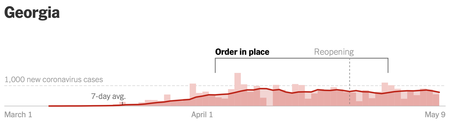
*Graphic obtained from NY Times reopening tracker
In Georgia, the governor started by allowing the reopening of personal care venues such as barber shops and nail salons and recreational facilities such as gyms, bowling alleys, and movie theaters on April 24. Three days later, he permitted restarting dine-in service at restaurants with restrictions. So far, the state has not seen a sharp rise in the number of COVID-19 cases, but there are other factors at play. Despite allowing these facilities to reopen, many businesses are choosing to stay closed. For some, especially small independently-owned businesses that run on slim margins, significant restrictions on operating capacity make the economics of reopening difficult. Others fear that they cannot secure adequate PPE to keep their staff safe, and many are worried about the larger public health implications.
Despite sparse re-openings, there are data showing increased mobility. Google’s COVID-19 Community Mobility Report shows a trend toward returning to baseline mobility for users going to retail and recreation locations. On Thursday, April 30, visits to retail and recreation locations in the state as tracked routinely by Google were 23% lower than a baseline calculated from Thursdays between January 3 and February 6, 2020. This is the smallest deviation below baseline since measures were put into place to control disease transmission in mid-March. Similarly, Apple’s Mobility Trends Reports for Atlanta, Georgia, the state’s most populous city, show the numbers of queries for driving and walking directions at their closest to baseline since restrictions went into effect. Queries for driving directions were 19% below baseline on May 4, compared to 60% below baseline in early April. This mobility data is not granular enough to determine how transmission may be affected.
Timing of shelter in place/business closure orders, reopening, and new coronavirus cases*
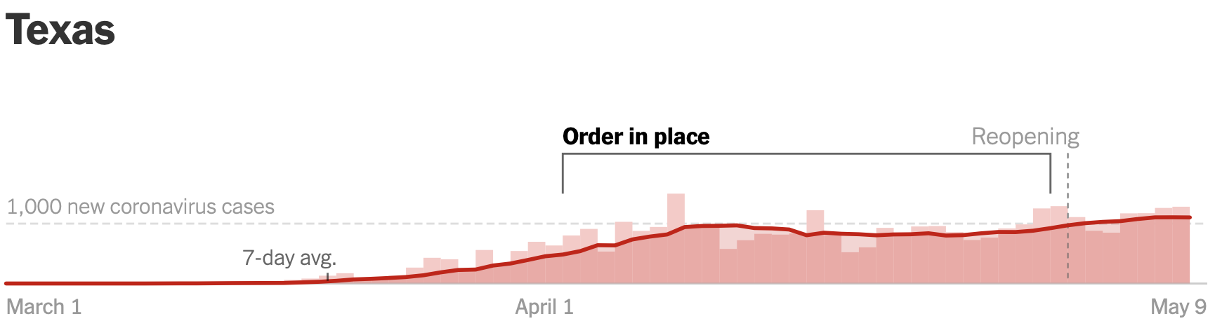
*Graphic obtained from NY Times reopening tracker
In Texas, where the governor allowed malls, restaurants, theaters, museums and libraries to reopen on May 1 with reduced operating capacity, there has been similar pushback from restaurateurs regarding the social and economic implications of trying to reopen at operating capacities that carry risk and financial disincentive with uncertain reward. A Texas Restaurant Association survey of 400 eateries conducted the day after the governor’s announcement on April 27 showed that the majority of establishments would not reopen right away or were not sure when they would reopen (47% and 10% respectively). Both Google and Apple mobility data show similar trends for Texas as for Georgia. Although it is too soon to see a true resurgence of disease, Texas had its highest 7-day average incidence of new cases since the pandemic started on May 7.
Neither state has had enough time to detect increased activity of influenza-like illness in their surveillance systems, as reporting of these data may lag one or two weeks behind. Keeping in mind that both states are increasing testing capacity, the number of cases as well as hospitalizations due to COVID-19 will be important indicators to monitor.
Summary
As locations around the world loosen public health and social measures, increased vigilance is required to watch for signs of COVID-19 resurgence. Multiple sources of data should be monitored to ensure early detection of infections and inform the public health response including, potentially, a rapid re-tightening of restrictions.